Video Game Research Magazine Analysis


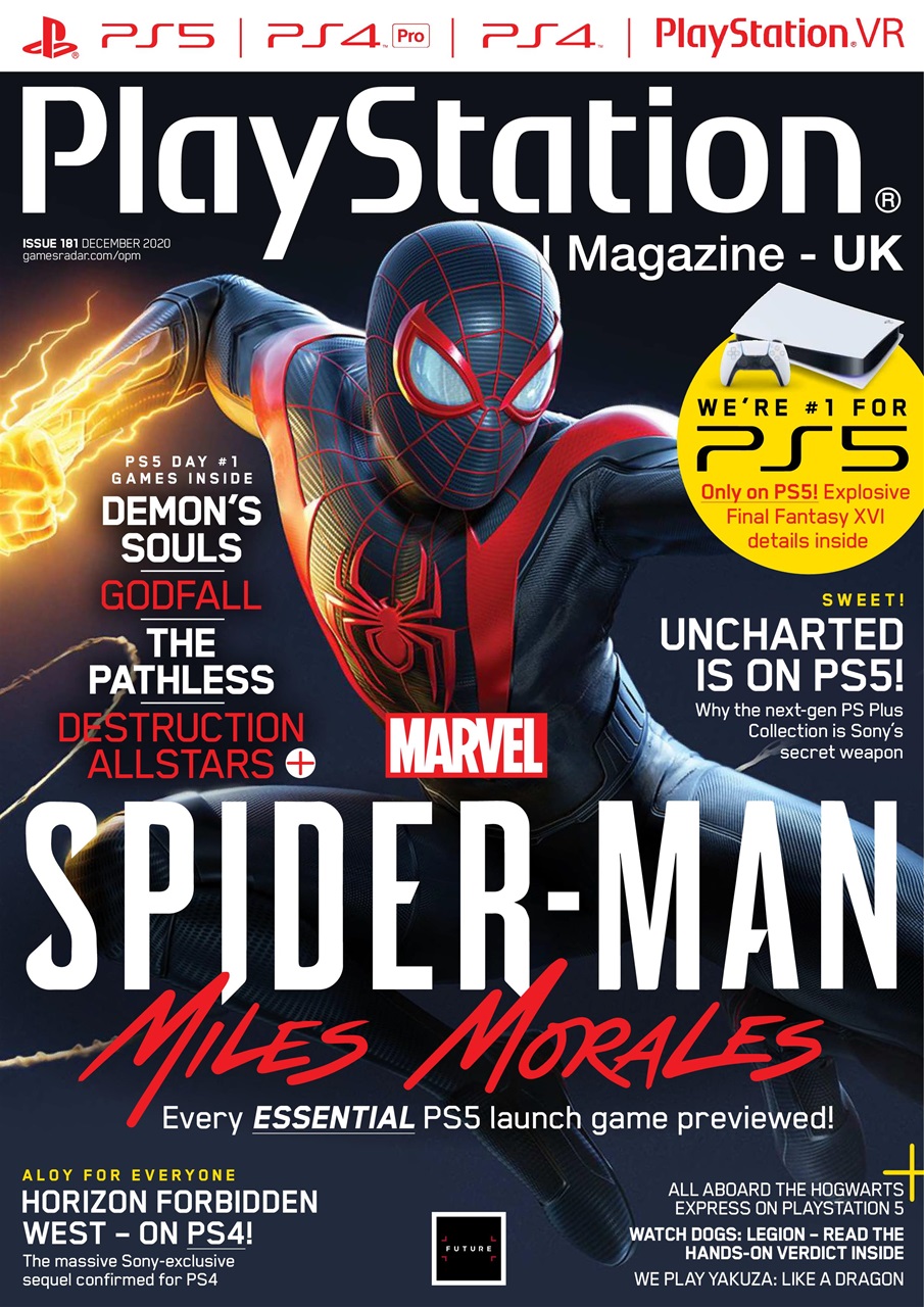
The PlayStation magazine as stated by the name is for PlayStation video games. The cover image is of Mills Morales, a well-known superhero. The text seems to be following a pattern of black and red. The target audience seems to be children and young teenagers. Even though the colors are on the darker side I think that this magazine could be for both girls and boys because Spiderman is a universal hero.


The masthead for this magazine is Games Master. The color scheme is very wide with many different colors. Maybe this was to create a sense of diversity. The main image shows a kid-friendly game paired with sub-images of more graphics games. This range of images leads me to believe that the target audience is on a wider scale, maybe 16-25 or older. The cover line includes the name of the sub-images games in a san serif font.

This magazine seems simpler than a usual game magazine. The masthead is PlayStation. The color scheme is very basic consisting only of red, black, and gold giving the magazine a more stylish vibe. The main image is a picture of a Spiderman in which he seems to be in a battle. The cover lines include other games that can be played on the PlayStation. There is also a flash promoting the next generation in PlayStation gaming with a picture of the PS5.
Contents Analysis


Comments
Post a Comment