Magazine Layouts and Feature Articles


Creating this magazine was a tiring and long experience, it allowed me to showcase my creativity and write about something I enjoyed. When designing the magazine, there were 4 key elements to consider, including the masthead, color scheme, font, and photos.
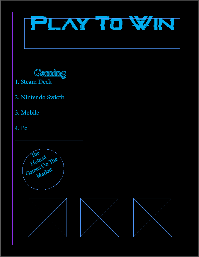
I chose a catchy title for the masthead to catch the reader's attention at first glance. When designing a masthead, it is critical to use an eye-catching font and layout that is also easy to read. I chose the name Play to Win because that is what most gamers intend to do when they play any game.
The color scheme of your magazine is also important because it establishes the tone and mood for the entire publication. When it came to colors, I went with a neon-based palette because that is what most gamers are used to. Using colors that readers are familiar with makes it easier for them to adjust to the magazine in general.
When choosing fonts for your magazine, it is critical to select a font that complements the overall tone and style of the publication. I chose the glitch inside fonts because they were the most reflective of the magazine.
Finally, selecting the right photos is critical for creating a visually appealing and engaging magazine. Because my magazine was about gaming, I photographed students playing video games at school. The goal was to demonstrate the joy of allowing students to play games at school.


Comments
Post a Comment